
The Value of Visual Dashboards
65 percent of people are visual learners. So how can we ensure that people within an organization are absorbing information? The answer is simple – dashboards. A dashboard is a visual representation that offers a fast and easy way to view information and company data in real-time. Visuals are vital in order for strategy to tell a complete story of a business, especially given that 84 percent of communications will be visual by 2018, and the average person gets distracted in eight seconds.
Visual communication has a huge impact on learning in comparison to written communication alone. Not only do visuals save a huge amount of time by relaying messages much faster, but it also leaves less room for misinterpretation. This is because reading alone leaves messaging entirely to your imagination, so information can be misunderstood and misinterpreted very easily. It has also been found that using visuals helps an audience remember the information more effectively, because images are directly deposited and stored into the long-term memory whereas words only make it to the short-term memory.
Fun fact: We can get the sense of a visual scene in less than 1/10 of a second!
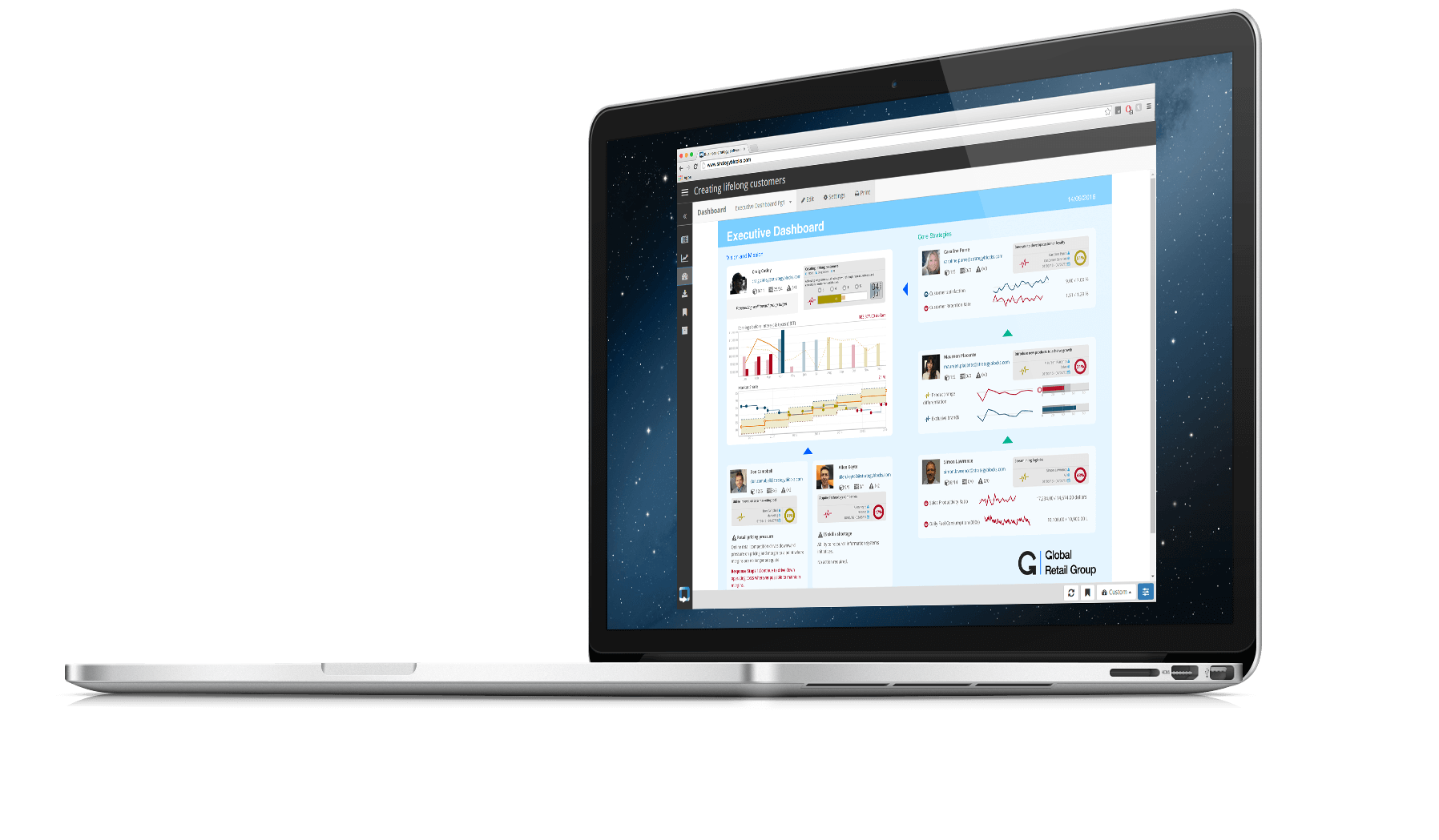
For these reasons, StrategyBlocks has taken the value of visual and applied it to our solution, using the latest in visual understanding and theory to ensure companies are able to communicate and collaborate on a much more effective scale. The platform offers different visual charts that provide all sorts of information such as growth metrics, operational management metrics, customer service metrics, and more.
Here are a couple of examples of the visuals included in the dashboards:
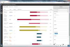
The Timeline Roadmap Chart
KPI and progress monitoring are made simple, and are easier to track with the Timeline Roadmap chart. It is a series of horizontal lines displaying the amount of work done in certain periods of time against those times actually planned. In addition, there are collaborative spray diagrams for brainstorming, and freeform custom dashboards.
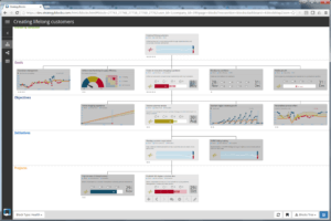
The Value Tree Diagram
The Value Tree diagram, based on the Japanese Hoshin Kanri SQM methodology, has had a number of iterations to ensure StrategyBlocks delivers information in the way a business needs and expects it. The Hoshin process employs a systematic planning methodology for making sure long-range, key entity objectives are defined, while allowing for an appropriate methodology tool that properly declares the strategic vision for the business and integrates goals and targets into a single holistic model.
With companies adopting this methodology, all employees have a much deeper understanding of the overall vision of the organization, and the strategy of how to get there. Visual data via the dashboards provides a great advantage, simplifying the strategic planning process while giving organizations the tools they need to effectively and efficiently answer what makes up their strategic plan. StrategyBlocks’ solution enables executives and employees to visually see progress across their organization. In addition, visuals are much more engaging, resulting in better motivation and involvement at every level and across all departments.
Let StrategyBlocks help your organization become more visual – get in touch today.
Leave A Comment